Refers to either text or buttons, they encourage or illicit a response in the user prompting a desired outcome. This outcome can range from buying a product to signing a newspaper or whatever the webmaster had in mind. Like all designs, there are good ones and there are ineffective ones, take for example NetFlix’s main webpage.

The bold red button encourages and reinforces the user to sign up for a month.

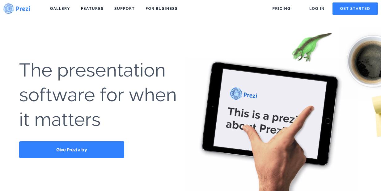
The same format holds for Prezi, a major online powerpoint creator.
If used correctly, Call To Action media will greatly improve communication with the user and their navigation of your website.
